

The journey through my third year, illustration, final major project.
31 Mar 2011
Busy Thursday continued
Been thinking more about text to quote my images today, just in case I do decide to use it, I don't want to leave it to last minuet. I did want to use those little transfer letter things; the ones where you scratch the back of them so they transfer to the new page. But I've seen lately that another course mate has started using them, so I don't really want to use them as well. Been playing with cut out letters from magazines, which is a similar effect. I also found some letter stickers I have. But I think I'd like to get hold of some alphabet stamps. This would definitely be less fiddly than cutting letters out of magazines!

A day of photos, photoshop and walls...
Busy day today. To begin with, we had a one day project for our 'identity' theme for the catalogue. The idea was to come in with images, ideas, or drawing materials, so that everyone can add a piece to the wall by the end of the day. I took in a few books, such as, a book on Paula Rego, a Vouge magazine and a children's fairy tale book to scan in to show some of my influences over the three years. I also took in some examples of Stina Persson's illustrations, as I've admired her work for a good few years now and I scanned in a couple of images from my sketchbooks.

I'm wondering how successful this wall will be however. I think photographed sections from the wall are being used throughout the catalogue, but I also heard Pete saying that the image will be wrapped around the cover of the catalogue. It was a good plan, but on seeing the completed wall, I'm now not so sure. It may end up looking like a random miss match of scraps. I think the wall may need to be added to still, and layered over if this is what were going for, or the current pieces need to be re positioned and more organised. I think that at the moment its in the middle of both. It may still look good if to use it within the catalogue,but maybe the usual black, embossed cover would look more professional?
We then had our individual and group photographs taken for the catalogue. Looking forward to seeing these!
And afterwards, I went back to sorting out my catalogue images. Took soo long! Really disliking photoshop at the moment! Don't really know what I'm doing with it. But I sorted out the images, changed the lion image slightly, which was an improvement, and got them into Louise on time. Job done. Thank God! Well actually not quite done it seems...we now need to write a bit about our work and send off our contact details to go alongside the images, but that shouldn't be too hard...


sketch book up dates:


Again, above I was thinking about things that maybe inside the families wealth, and that I could include in my images to relate to the story and the symbolism of fire/ ash.
Derek's scan

(Section from our wall)
I'm wondering how successful this wall will be however. I think photographed sections from the wall are being used throughout the catalogue, but I also heard Pete saying that the image will be wrapped around the cover of the catalogue. It was a good plan, but on seeing the completed wall, I'm now not so sure. It may end up looking like a random miss match of scraps. I think the wall may need to be added to still, and layered over if this is what were going for, or the current pieces need to be re positioned and more organised. I think that at the moment its in the middle of both. It may still look good if to use it within the catalogue,but maybe the usual black, embossed cover would look more professional?
We then had our individual and group photographs taken for the catalogue. Looking forward to seeing these!
And afterwards, I went back to sorting out my catalogue images. Took soo long! Really disliking photoshop at the moment! Don't really know what I'm doing with it. But I sorted out the images, changed the lion image slightly, which was an improvement, and got them into Louise on time. Job done. Thank God! Well actually not quite done it seems...we now need to write a bit about our work and send off our contact details to go alongside the images, but that shouldn't be too hard...


I chose these two images above for the catalogue as they were, at the time, my most recent images which, I believe, portrays my style as suggestive and narrative. I also hope that they are good examples to show my drawing skills and like for mark making.
sketch book up dates:

Here I was just considering what Jonny and Louise mentioned about indicating a scene/ setting or class of wealth.
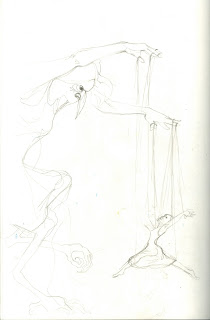
I also had the idea in my head of adding a male face, that is of a larger scale than the house, and is either looking through a window, holding the house in his hands, or dangling the house on puppet strings. This was to portray the idea that the father, though not really mentioned in the story, is a significant character. His is the reason behind all events which make up the story. In away, he is causing the actions of the mothers, who in turn determine Ashputtle's actions.

Again, above I was thinking about things that maybe inside the families wealth, and that I could include in my images to relate to the story and the symbolism of fire/ ash.
Derek's scan

30 Mar 2011
Print room...again!
Another print room day today. Finished putting ground onto my plates and varnished all the sides to stop the acid from biting into the edges. This took quite a while but I'm glad its all done now.


While I was waiting for things to heat up and other things to dry when preparing my plates, I tried a few other things.
Firstly, I made up some backgrounds that I could use in photoshop for some of my images. Remember me saying that I could drop a background colour behind like I did for my lilly images that I'm using for my portfolio? Well I thought a textured background would be more interesting. These examples below also remind me of water marks and drops which relates to my project.


(I've mono printed some fish into this one above)


And here's another 'shoe fitting' idea that I might like to use as a final.

Derek seemed to quite like this one. He liked how the legs were left without detail, the chair was detailed in parts, and then unfinished in others, but that you could still understand its form (i like this about it also) and he thought it was very suggestive and atmospheric which is good :). He also saw the recent unfinished image i've done with the background inspired by Verhoeven's way of working. He said it reminded him of a magazine image of layered drawing of shoes that he's seen. He's going to bring it in for me tomorrow...It's photo day tomorrow!
29 Mar 2011
Degree show presentation slide show
Jonny showed us some photos of previous illustration shows, and how the students presented their work. Ideas that I thought of during this time was to use many frames of different sizes hung closely together but at different levels. Some of the frames will hold my images, and some frames will hold a print of some wall paper I have. This can symbolise the type of interior that can be found within Ashputtle's rich fathers house. I was also thinking I could paint my image of a grand fireplace onto my wall space and then hang my images above it as if they are happy family portraits....?
We also had today and then Thurs to hand in two images on a CD to Louise to put into our catalogue. I wanted to get it out of the way today, but I wanted Louise to check through my choice of images. She was obviously busy today and I didn't get to see her till the end of the day. I decided that I will use my lilly image and my 'lion with a monocle' image. But (and here's proof that I'm not a very technical person,) my colours weren't set to the right kind of setting or something, meaning that when I went to print them or put them into the catalogue, the colours would change and be a lot duller...? And I could rectify this with Louise, as i needed the original scans of my two images to create them again. :( I've now scanned in these images again, and Louise said she can help me finish them on Thursday.
Been in the print room all day. I've been preparing some etching plates, ready to etch onto over the Easter holidays if I need to. The problem is, I don't Know what size my etching will be yet as I haven't got final compositions. But I've cut down 4 large plates, probably the size of A3 and two plates around half the size of this. I want to produce at least 4 etchings for final pieces. Jon the technician told me that if these plates end up being too large and my image doesn't fill the whole space of a plate, I can then go back and cut down the plate some more, after I've etched onto it. He also told me that I can get large sheets of carbon paper from staples. This means that I can transfer a design that I'm happy with straight onto my plate. Good news! I've filled down all sides of my plates. So I'm back into the print room tomorrow to continue.
28 Mar 2011
Degree show presentation workshop
Today Pete showed us a few methods to hanging our work when it comes to the show. He showed us examples using magnets, bulldog clips, fishing wire, frames (using the floating method) and using mount board. Its actually made me feel more relaxed when I think about how I'll frame my work. The methods were a lot easier/ simpler and less time consuming than I first thought, yet they are all very effective. Initially, I thought I would use frames to hang my work, not for any particular reason. But after this workshop, I quite like the magnet method. Its very clean and minimalist so it doesn't detract from the work.
More sketchbook stuff...

This image was again experimenting with shadow and suggestion. The girl is trying on the shoes. At the moment, it is unclear whether the girl is Ashputtle or one of the sisters. But I actually quite like it being this way as who ever the girl is, the outcome isn't good either way. If it is the step sisters, the step mum will realise that the shoes do not fit them and she will cut their feet until they do fit. If it is Ashputtle, her mum will encourage her to put her feet into the bloody shoes and marry the prince, 'escaping one kind of sexual ordeal for another. Out of the woods, into the kitchen and the bedroom' (Warner, 'From The Beast to the Blonde'.) The image will include the shadow of the step mother across the girl, and a bird (symbolising Ashputtle's mother, will be watching from the window.) I don't want to illustrate the actual cutting of the feet, because I think this will be giving too much away. I want to build suspense and atmosphere and I want viewers to imagine the cutting for themselves.
Week Summary : week 10. 28th March - 3rd April
- Degree show presentation workshop with Pete
- Sketchbook work
- Degree show presentation, slide show with Jonny
- Catalogue images
- Print room: preparing more etching plates
- Sketchbook work
- One day project: 'identity' wall for degree show catalogue
- Photos: for degree show catalogue
- Sketchbook work (plus consideration of text)
- Tutorial with Derek
- Print room: experimentation of etching with fabric and textures. Completion of three prints.
- Stamps
27 Mar 2011
Fundraiser!
Was the fund-raiser last night at Hamptons! Was goood! Thanks Kim! I brought a guest too so I gave a few more pennies to the cause. Every little helps! I made some more brownies too, (made some for one of our first cakes sales and they went down well!) these were not so good however and were not very saleable- unless people didn't mind scrapping up gooey chunks from the pan with their hands? No? Didn't think so. Made a good snack when we got in though!
over the weekend, I've just been trying to quickly sketch out some more ideas and compositions. Here's my latest sketchbook pieces...


In this one, I had an image in my head of the father and the two mothers photographs hung in ornate frames, above a decorative fireplace. I have also includes a candelabra on top of the fireplace the refer to Ashputtle as a burned child and the mourning she suffers. I want two of the candles to be burning fiercely to symbolise the two mothers determination and the third to remain unlit, symbolising the fathers passivity. This again was just a quick sketch to get my ideas down on paper rather than witting a description of what I want to draw. But I would like to go back to the image redrawing it, with the hands of the three parents coming out of the picture frames to operate puppet strings. Ashputtle may be included within this image, but it might be necessary to leave her out to keep the image suggestive. I can also include some details of the story within the decoration of the fireplace , like the photo of the fireplace below. (I took these photos at the Russell Coats Art Gallery and Museum, in Bournemouth two years ago). The use of the fireplace and photo frames will help to suggest a scene, a situation which is what Jonny wanted to see more of. I did this more for my last project but haven't really included it for this FMP. Doing this will also give and idea of the wealth that is mentioned at the beginning of the story,'a rich man..'


And here, I was quickly sketching from quotes taken from the book about how a mother's love 'winds about these daughters like a shroud'. I like the juxtaposition of the two ideas here, how a mothers love is liked to the protection in death, like she's suffocating her daughters. And I also sketched from a section of the story about dancing, and the silk dress that one of the sisters demanded.

I also like this final image design of the revived mother controlling Ashputtle. It is again unfinished, as it was just to get the idea down. The image is based on the quotes, '...her mother, though dead, was no longer gone and henceforward she must do her mother's bidding.' and ''(her mother) stayed close to Ashputtle, pecking her ears to make her dance vivaciously, so that the prince would see her.' However, this image is lacking any background.
Oh, and I've been looking into the symbolism of the fish and the hazel tree branch within the story more. Here's some websites I found interesting.
I've been starting to panic recently :( I feel a little bit like what I have produced so far isn't very good and that my project isn't very strong. Its hard to explain why. I feel like what i have produced for the majority of this project, I probably wont want to use them as final ideas. I need to start thinking about compositions i would like to use.
over the weekend, I've just been trying to quickly sketch out some more ideas and compositions. Here's my latest sketchbook pieces...

Above, the main idea was to experiment with shadows and suggestion.

In this one, I had an image in my head of the father and the two mothers photographs hung in ornate frames, above a decorative fireplace. I have also includes a candelabra on top of the fireplace the refer to Ashputtle as a burned child and the mourning she suffers. I want two of the candles to be burning fiercely to symbolise the two mothers determination and the third to remain unlit, symbolising the fathers passivity. This again was just a quick sketch to get my ideas down on paper rather than witting a description of what I want to draw. But I would like to go back to the image redrawing it, with the hands of the three parents coming out of the picture frames to operate puppet strings. Ashputtle may be included within this image, but it might be necessary to leave her out to keep the image suggestive. I can also include some details of the story within the decoration of the fireplace , like the photo of the fireplace below. (I took these photos at the Russell Coats Art Gallery and Museum, in Bournemouth two years ago). The use of the fireplace and photo frames will help to suggest a scene, a situation which is what Jonny wanted to see more of. I did this more for my last project but haven't really included it for this FMP. Doing this will also give and idea of the wealth that is mentioned at the beginning of the story,'a rich man..'


Above I was playing with the idea of Ashputtle unwillingly being forced to dance or to move.

And here, I was quickly sketching from quotes taken from the book about how a mother's love 'winds about these daughters like a shroud'. I like the juxtaposition of the two ideas here, how a mothers love is liked to the protection in death, like she's suffocating her daughters. And I also sketched from a section of the story about dancing, and the silk dress that one of the sisters demanded.

I really like this image above, although it is unfinished. This was a final image design inspired by the Julie Verhoeven images I posted recently. I was trying to create a sense of a back ground without actually drawing the layout of a room ect. I like how there is lots to look at and how every individual section holds symbolism or helps to set up and tell the story. I need to complete this in ink. but I'm also thinking of photocopying it onto acetate so I can experiment with medium behind the image.

I also like this final image design of the revived mother controlling Ashputtle. It is again unfinished, as it was just to get the idea down. The image is based on the quotes, '...her mother, though dead, was no longer gone and henceforward she must do her mother's bidding.' and ''(her mother) stayed close to Ashputtle, pecking her ears to make her dance vivaciously, so that the prince would see her.' However, this image is lacking any background.
Oh, and I've been looking into the symbolism of the fish and the hazel tree branch within the story more. Here's some websites I found interesting.
Fish in the Chinese culture symbolizes wealth. Fish also symbolize harmony, marital happiness and reproduction because they multiply rapidly and sometimes swim in pairs. Chinese legend says people placed messages in the bellies of the fish, and thus the fish has come to symbolize communication with a distant friend or loved one. Fish is an important symbol in the Buddhist religion and are among the auspicious signs on the Footprints of Buddha. The fish on the Buddha footprints signifies freedom from all restraints. The most popular fish motif found in Chinese art and culture is that of the Carp or Koi fish. Known to most Westerners as Koi Fish, the Chinese carp has numerous symbolic values within Chinese culture. The carp is a powerful symbol of strength and perseverance. The scales and whiskers of the carp resemble that of a dragon, a great symbol of power in China.
25 Mar 2011
Work in Progress
A work in progress meeting is when a group of us are put together with a tutor. We then have to each present our work so far to the group. We are given feedback from the tutors and each other.


Here are a few sketches of scenery i quickly played with today


the girl above has tree root-like legs which i quite like the idea of. This again symbolises the connection with her dead mother, the tree which allows the return of her mother and Ashputtle's mourning.
Jonny and Louise we taking our group today. They both thought that my work was getting a bit repetitive. Which I agree, there's a lot of women, in blue ink. I need, really, to get experimenting with the stitching, and etching. Louise also said she'd like to see me placing the characters into more of a scene. I agree with this too. I draw the women mostly unfinished or floating on a white page. I think this is mainly because when I draw these images of the women and I'm pleased with them, I'm then hesitant to do anything else to it in case I ruin it. I do like the overall look of these images, but for this project, including some sort of background would support my work. Jonny also said to us all that we may like to go for finished images now, so that we have plenty of time to figure out what works or not ect.
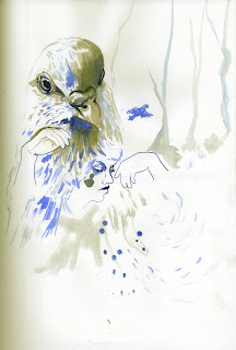
Louise suggested that I work on larger paper to draw my bird women, to really get into it and to be able to compare them easily. I think this will also help me to not be so precious. She also suggested i make my bird women scarier. I was planning on doing this, so that it refers to the nature of Carter's stories. Ive been thinking about using storks for the bird women. They will then refer to the motherly idea of a stork and baby. But the storks long beak is more sinister than the ones i've been drawing. It also looks sharp and in the shape of scissors. This can relate to the step mum ordering her daughters to cut off their own feet!
I've been considering backgrounds. I've gone back to some of my images (that I have already uploaded on here) and added simple suggestions of trees in a very pale, watered down ink. This creates more depth to the image and a suggestion of where the character is. I quite like the simplicity or subtlety of this...

(I like the branch legs too)
I also think that the images that are floating, wouldn't look too bad on a simple coloured background. for example if I took an image like this...

...and put in a background colour on photoshop, like I've done for a previous project image below...

Or I've been looking at what Rego's etchings and the backgrounds within them. Adding scenes like these can allow me to use more symbolism and create a more intense image.
Or, id quite like to produce more back grounds like these images by Seiko Kato and julie Verhoeven

Kato

Verhoeven
this can be done by just incorporating various imagery from throughout my sketchbook into one image. This will allow for the use of more symbolism and make my illustration more interesting as it will have more to look at!... I've almost done it here (below) but the image can be added to.

Here are a few sketches of scenery i quickly played with today


the girl above has tree root-like legs which i quite like the idea of. This again symbolises the connection with her dead mother, the tree which allows the return of her mother and Ashputtle's mourning.
23 Mar 2011
Pres Doc Tutorial
Had a talk with Alexandra today about this blog and my C.V.
C.V is almost there, just need to add a bit about myself.
Pres Doc is looking good! Just need to be a little more critical about some things, such as why I like the references that i upload on here or how it is related to my own work. She said that i might not have to do the whole printing out this blog and turning it into some kind of book anymore. I so hope so, its going to take up a lot of time to do this, right before the FMP deadline as well. Also think of all the ink and paper it will use! Fingers crossed.
Drew another bird woman today, quite like it, i like the weird composition. The bird is larger than the girl and so its over powering her. It also looks like the girl is coming out of the bird, like its a part of it. Ive made the girl look like she has puppet hands too, like they are being held up above her head, unwillingly on her behalf. This refers to the mum (and also the dad and step mum) controlling her life for her.


Also went to the library and got out a Rego and Goya book to look at how they use etching with aquatint

'The House Under the Ground' p. 201


Playing around a bit with levels

This one bellow has more of an atmosphere to it i believe

Also went to the library and got out a Rego and Goya book to look at how they use etching with aquatint
'Paula Rego' by John McEwen p.174
 '
''Three Blind Mice'

'The House Under the Ground' p. 201

'Wendy Sewing on Peter's Shadow' p202
'Goya Images of Women', by Janis Tomlinson, pg 260

'Pretty Teacher'

'Till Death' pg 247
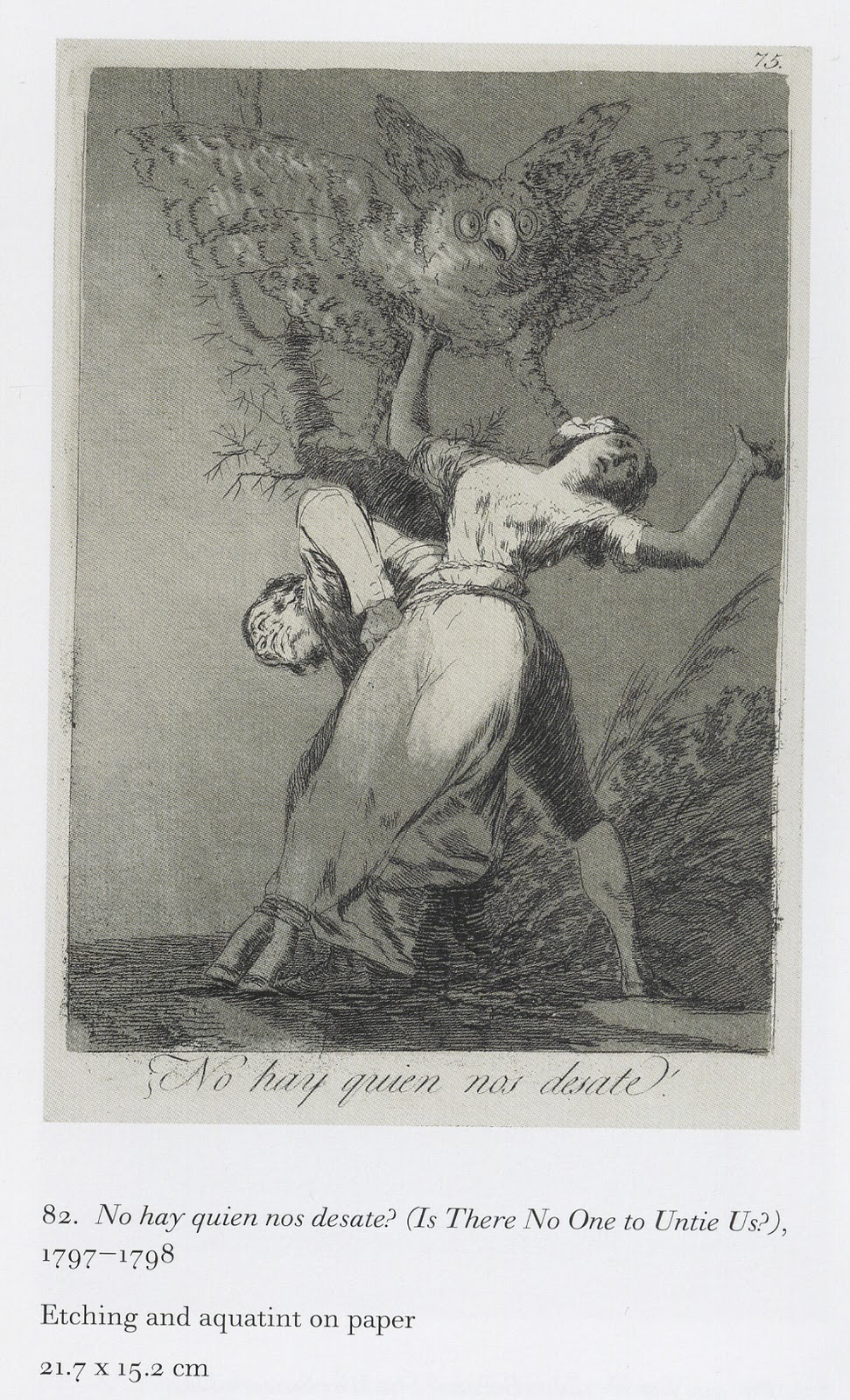
'Is There No One To Unit Us?' pg 269
22 Mar 2011
Landon!

School trip to London today! We went to Somerset House to see their 'Pick Me Up' gallery, which was pretty damn awesome! Here's Somerset House's website with a list of the people who's work we viewed today
And here's some photos i took of things that really made my eyes happy...
(Artists name...)
their site

(Their work)


She draws a lot of women, like me!


(I really like the use of bull dog clips to hang the images. Something simple and quirky about it!)


(Becker's above image can link to my puppet theme)
Seiko Kato
The pieces that she had up in the exhibition were of very intricately layered collage.

Doll/ puppet?!

(The above image by Kato also makes me think of my own frame that I produced in the previous project)
Below are other examples of Kato using collage. They are also examples of her own bird women!


On viewing Kato's site, she uses a lot of mediums such as ink and stitching too. Her ink lines hold a quality similar to my own style when I use only a dip pen (Possibly not totally obvious in the pics of my own sketches in here, as I've mainly used a brush pen so far).

Kato

Kato

Kato

Kato

Kato
And three of my own...


Also i ckecked out a girls website, Zara Wood, who's work was in the exhibition. Found this ...

Its quite similar to the idea i had of using my images for a quilt, relating to the quote, I've made my bed, but I can choose to change the sheets...'

Some of us also went to see the Gallery that we will be using for our London show in Brick Lane in June. Looks impressive! Well done Kim for all the searching and organising!
This guy has his exhibition up in the gallery at the mo, we took a little look.


A giant stalk!!! Wonder how they managed to produce this! This caught my eye, not just because its HUGE, but because it relates to the info I read in Warner's 'From the Beast to the Blonde'. She discusses the links between a stalk and a mother figure. She also explains links to illustrations of women with webbed feet (or none human feet) to the devil in disguise.
This unknown artist has captured the feathers very well and the scale creates an atmosphere, making the bird appear threatening. (It probably would not have this effect if it were in a much smaller sketchbook).

....And me being a tourist!


Brought myself a portfolio and sleeves from London's Atlantis Art Materials on Hanbury Street. Was about 40 squid, but looks very smart!
Subscribe to:
Posts (Atom)