Had a tutorial with Derek. He thinks I need to get out of my sketch book more. I was definitely planning to do this over Easter when I could just concentrate on the FMP not catalogue stuff ect. He said he likes what iv'e done but he really wants me to push myself out of my comfort zone and to not be scared to try things just because this is the FMP. We talked for a rather long time but was all very helpful.
He was concerned after seeing my recent image of the girl sat on the sofa. He wondered why I wanted to take it through to etching, as it would just end up looking the same as it does in the sketchbook. He didn't think etching would add anything to it. But I explained that I have now created this image in the way I have, because of the etching. Before, I would have just drawn the outline of the girl, and probably without any detail in the background too, like I did for the last project. But now that I'm starting to work in etching, that I am understanding the process and I have seen other examples of etchings, I have stated to adapt my images slightly (by thinking about shadows and interiors ect.) So etching seems to be improving my sketch book work too.
I told Derek about my concerns of maybe having etching and stitching in the show. I didn't want it to look to random and I said about maybe stitching into the etching prints to link the two (like stitching trees into the background for example). Then Derek told me that you can actually transfer fabric textures onto the plate. (like these examples below which Charles showed me).
(Fabric)
(Tissue paper)
I happen to have some embossed wallpaper with me ready to mono print if I wanted to use the famed interior idea previously mentioned. So I spent the rest of the day (literally, till 8pm!) in the print room experimenting with this.
I firstly tried transferring the wall paper design onto a small plate to see if it worked. It did.
(strip 1: inked wall paper. Strip 2: pressing the wall paper into the soft ground on the plate to transfer the pattern. Strip 3: printed etching of the wall paper.)
So I then drew the girl on the sofa image onto the plate ready to print. The idea being that i print the wallpaper behind her. I haven't gotten this far yet though as Charles and Jonny seemed to like the print as it is. Charles thought I should get as many prints of the plate in its current state before I change it. I now have three prints of the pate and one of the tester wall paper.
(1st print)
(2nd)
(3rd - I think its hard to tell! sorry for the crappy copies, couldn't scan them yet 'cos they're still wet.)
Because the pates are quite large, it takes me a long time to ink them up properly before I actually get to print anything. Before I print, I also need to soak the large 'summerset paper that I'm using in a water bath. I do this for about 10 minutes so that the paper is flexible enough to be pushed into the scratched lines of my plate while going through the press.
The paper then needs to be put in between two sheets of plotting paper to soak up the moisture
While the paper is drying, I cut a piece of news print to the size of the paper that I'm printing on to. I then place my clean plate in the middle of the newsprint paper and use a ruler to work out where to place my plate (when inked up) so that my image appears central.
Now I can ink up my plate using intaglio ink. I mix 'ocean blue' with a little bit of black. I use blue while printing, for the same reasons as why I used blue ink in my sketch book. Blue symbolises sadness, Ashputtle is in mourning. It symbolises the tears she cries onto her mothers grave and the fish that is a re- incarnation of her mother.
I then use 'scrim' (netted fabric) and tissue paper to take off the excess ink. I whipe any excess ink off of the edges of the plate and coat then with chalk powder. This is to prevent a tick dark line printing around the outside of my printed image. Makes it nice and neat!
Plate is now ready to put face up onto my news print, on top of the press, using my measured guidelines. I can now put my soaked paper on top of the plate, using the size of the news print as a guideline. Next the paper is covered with tissue paper and the blankets, to prevent getting marks on it. Now I can roll the plate through the press. Done.
Print can be removed, put between sheets of clean news print and tissue paper, then under a heavy wooden board and weights. This keeps the print straight while drying.
I need to take all this into consideration and organise my time in the print room well. Hopefully I'll get quicker with more practise. Really hope this works. I can add the wall paper and the aquatint next week hopefully; we break up for three weeks for Easter today, but the print room is going to be open on Thursdays and Friday, so I can still come in.
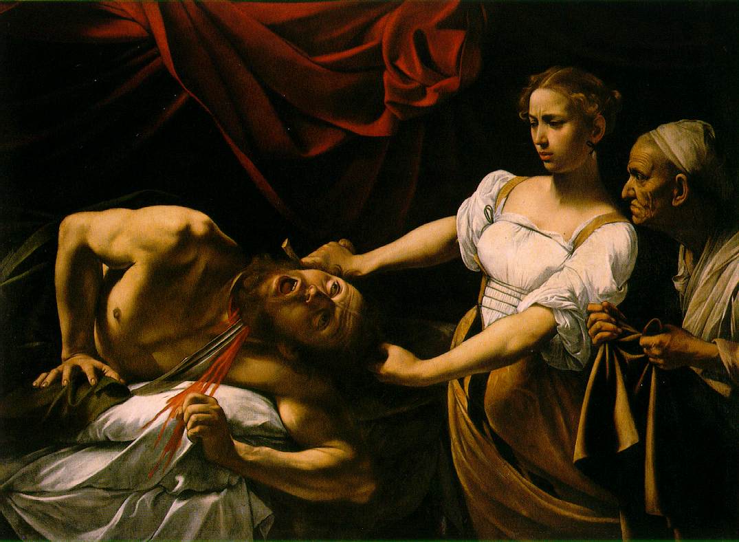
I need to look at shadows more to inform my work. Would be good to look a Caravaggio and the way that he uses light and shadow to enhance his images, as well as continuing to look through the Rego and Goya books I took out.
http://www.ibiblio.org/wm/paint/auth/caravaggio/judith.jpg
I also remembered that I did a 'shadow' based A level project. I didn't realise it before, but I guess, looking back now, that my interest in the sinister may have began as far back as five years ago! Some of these photos that I took of my boyfriend for this project might also be useful... ha! (Sorry Jem for digging these out again! Tis' for a good cause! :) )